
When the Walker Art Center launched their redesigned website in 2011, it was hailed as a “game-changer,” changing the focus of the site from the museum as destination to the museum as content provider—a portal to all things related to its mission. This was a great example of breaking the bonds of skeuomorphism (in this case, a website that recreated the functions of a set of print museum brochures) and take full advantage of how digital publication can be truly different from print. Last month the CFM Blog featured one example of how museum publications are evolving in the digital realm: “Curious,” the Royal British Museum’s new multi-sensory journal. So when I heard that the Walker was exploring the creative limits of digital publication, I invited their staff to tell us about the project.
Emmet Byrne, Design Director
On June 30th, the Walker Art Center published the first volume of its Living Collections Catalogue, its contribution to the Getty Foundation’s Online Scholarly Catalogue Initiative. As a contemporary art center dedicated to presenting the most innovative visual, performing, and media arts of our time, the Walker conceived an online serial publication that would be tied to its acquisition strategies and collections-based exhibitions.
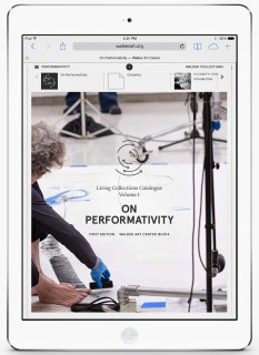 I have learned, from this project and from all of our online publishing initiatives, that creating new publishing platforms can change how an institution works and thinks. When our departmental blogs went live in 2008, they gave everyone in the institution a voice, which resulted in new ways of contextualizing our programs and communicating with niche audiences. When we launched our redesigned website in 2011, it changed the way we think about interpretation, about the services we provide as a contemporary art center, and even the definition and scope of who our audience could be. In many ways we are still figuring out how to live up to the promise of this platform and our relationship with it changes day to day.
 The Living Collections Catalogue project exemplifies this change in our thinking. We realized early on that the platform we were creating to host collections-based research could also guide this research and have a positive affect on the exhibitions themselves. Having an online publication for each upcoming show—something that can be turned into a template and produced faster than a traditional publication—gives the curators a new format that directs their thinking in a consistent framework. The themes reflected in the wall labels can be fleshed out, illustrated with images and rich media, linked to the wealth of information in our collections database and shared with an incredibly broad audience. We hope that this new publication process will complement and strengthen the collection exhibitions process.
Designers know that “visual rendering”—making something look real even when it is still speculative—is an essential strategy for moving an idea forward. As a publishing platform the Catalogue exists somewhere between a rendering and a prototype: highly developed but still somewhat speculative frameworks for future content, only made real once they’ve been used. As museums respond to the influence of the internet on how people consume content, it behooves us to understand how our publishing initiatives not only push our content out to our publics, but how they change our own organizational culture.
Robin Dowden, Director of Technology and New Media Initiatives
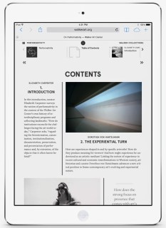 The main takeaway for me is the challenge and excitement involved in creating something completely new based on a sophisticated understanding of book publishing and online initiatives. The Walker is an award-winning book publisher and a leader in field of museum work on the web. What happens when we try to bring the best characteristics of each of these two worlds to bear on a single project? The Getty initiative is about creating new models for the future of scholarly collection catalogues, and from the outset we were interested in bridging the gap between the database and publishing, playing to the strength of each depending on the information (knowledge) we were sharing.
The iterative and dynamic nature of new media runs afoul of traditional publishing in so many ways, from the editorial process to the role of the designer. For example, we built an authoring tool to create essays, the most bookish piece of our catalogue in terms presentation and versioning. The tool allows “a user” to construct an essay as a series of multi-column sections composed of various document elements including text, pull quotes, images, rich media, and slide shows. We imagined the tool would be used by an editor or subject specialist assigned to the volume (a role in book publishing traditionally assigned to the designer). Building the tool was a very new media approach, reflecting our penchant for systematizing content production schemes, but we misjudged the process for laying out the essays, media selection, and workflows: authors were not necessarily writing to the medium. We found we needed someone unafraid of the technology and possessing an understanding of various assets and resources—internal and external, identified and not—to work with the new media designer and volume content editor on page layouts. We needed a much more layered and iterative approach (e.g., dropping in footnotes at the very end and editing in pieces as content becomes available) for efficiency and quality of final product. Going into volume 2, we certainly have a better understanding of what’s involved but the fact remains that traditional author, designer, editorial roles and workflows aren’t a perfect match with online publishing. That said, the evolutionary nature of the work, from constant changes in the medium and platform to our understanding of them, is what makes this work challenging and exciting. I wouldn’t have it any other way.
Skip over related stories to continue reading article



Comments