This article originally appeared in the July/August 2015 edition of Museum magazine.
Creating digital interactive experiences in museums can be costly and time-consuming. Given the financial and human resources required to create high-quality interactives, what are key performance indicators and what qualifies as an acceptable return on your museum’s financial investment? At the 2015 AAM Annual Meeting in Atlanta, the session “Demanding More from Interactive Media” addressed these questions and more. Josh Goldblum, founding principal of the Philadelphia-based media design firm, Bluecadet, led the discussion, with members of the audience also posing queries. The other presenters were Taylor Peterson, media and interactives coordinator/project manager, Field Museum of Natural History, Chicago; Marla Shoemaker, senior curator of education, Philadelphia Museum of Art; and Kate Tinworth, independent consultant, ExposeYourMuseum. Following is an adapted excerpt of the discussion.

How do you plan for interactive media in an exhibit?
Shoemaker: You have to have your goals straight. You have to know why you want to use media, what it brings to you. It brings a different experience in the galleries, expanding the opportunities for visitors to engage with objects. Because it’s expensive, you use interactive technology when nothing else will do for the experience that you want to create.
Peterson: If it’s a really complex concept, sometimes a digital touchscreen is just the way to organize all of that content and to step visitors through that experience. Sometimes it’s simpler. Maybe our gallery doesn’t have a lot of objects, so we look for some immersive media or big media pieces to round out the entire experience.
Tinworth: When I am thinking about evaluation, I always want to think with the end in mind. I want to start with the anticipated outcomes that we want to reach. So I want to start with the focus on audience. Planning is going to involve getting all the players around the table as soon as possible—a dynamic team that represents all the different departments or divisions of your museum that you know should be involved. Sometimes those are players you wouldn’t necessarily consider from the get-go.
What’s an example of interactive media that’s been successful for you?
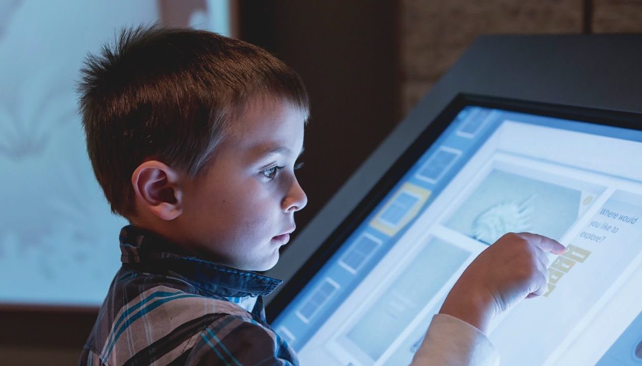
Peterson: We have a high-traffic area on the second floor of the Field Museum called the Searle Lounge. This is an exhibition space that includes our display of [Tyrannosaurus rex] Sue’s real skull along with interpretive material; the majority of the skeleton is on the main floor. It’s not a closed-off gallery—it’s a walk-through space that’s highly trafficked because there’s a restroom there and our 3-D theater is located around the corner. So when plans were made to upgrade and spruce up the lounge, we saw an opportunity to maximize on that foot traffic and put in something that’s exciting and fun. We developed a puzzle where you can put together Sue’s skeleton using images created from 3-D scans of her bones and access additional content. It’s a successful interactive that’s constantly being used. Sometimes during down hours, this is still a place that always has a kid in front of it, using it.
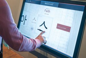
Shoemaker: When we presented the exhibit “Treasures from Korea: Arts and Culture of the Joseon Dynasty, 1392-1910” a couple of years ago, we did early focus groups and learned that nobody wanted to come to the exhibition. Nobody knew anything about Korea. Even Korean people said, “We’ll come, but probably because we’ll feel guilty if we don’t come.” And yet we were really invested in this material—it was a beautiful show. We decided early that we needed to figure out what kind of experiences we could add so that people wouldn’t feel stupid because they didn’t know anything about Korea. They needed to engage with the material and think about it in a new way without feeling like they had to have a lot of prior knowledge. So we built three different interactives. One brought a book to life; many of you know that books basically die in exhibitions when they’re in a vitrine open to a single page. We also interpreted a 14-foot-long, folding “10 longevity symbol” screen. We wanted to tell people, “Within this big landscape, there are 10 symbols of longevity. You can touch one of them and find out why it is a symbol of longevity.” And finally we created an experience where you could write your name in Hangul, the phonetic Korean alphabet. It shows you what your name looks like. Then you can use your finger to write your name and see what your handwriting looks like in Hangul. You can print a little ticket and take it with you.
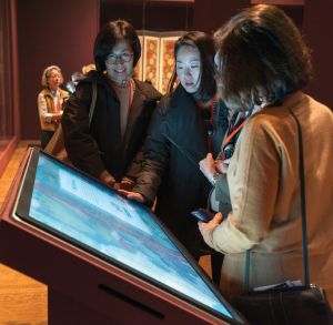
Hangul was invented during the Joseon Dynasty, which was the theme of this show. It was the first phonetic alphabet in Korea—the biggest cultural contribution of the whole dynasty—so we knew curatorially we were in the right place. However, all people wanted to do was write their name. We had to install a second station because the lines were so long. People wrote their children’s name, their grandchildren’s name, their cat’s and dog’s name. Nobody read the opening screen that we worked so hard on, which explained why Hangul was important. They just went right to “start.” They were watching and they couldn’t wait to write their name. It’s partly a credit to how beautifully the interactive worked. When you touched the screen, the slower you went and the wider the ink spread. It felt like an authentic experience of writing with ink. We took the text from that opening screen, which was only three sentences, and we made a sign. Visitors had to wait in line, and they could read the sign on the wall. So we used analogue to get the content across, but the experience was the writing of the name.

How can museums evaluate gallery media?
Tinworth: When you’re thinking about evaluating digital products, the best thing is to start at the very beginning, even when it’s just a scrap of an idea, and test that out first. Have the audience voice with you the whole way.
Peterson: What we do internally is set up the concept. We can test concepts and ideas well before the programmers even make anything, which usually involves a lot of paper prototyping that we can do on the floor with visitors. Visitors sometimes are really into the concepts and sometimes they’re not, and if they’re not, we have to go back to the drawing board to figure out whether we’re doing the right thing or if we need to do something completely different. You can come back later when you have some PDFs or screenshots to test rough designs of the layouts and user interfaces.
Shoemaker: We took curatorial texts for the new interactive we just built into our permanent collection gallery and sat with visitors and said, “Would you read this? Would you circle things you like and cross out things that don’t interest you as much, and talk to us while you’re doing it?”
When you’re producing all this amazing content for an interactive, how can you deploy it in advance to engage audiences?
Peterson: This brings up a current issue for us. For our front-end Web experience, we want to create some sort of teaser for our new Cyrus Tang Hall of China. We want to give a good snapshot of what this exhibition is, have visitors say, “Oh, we’re going to see that in there?” but not, obviously, put all the content from the exhibition on the website. Since we do have a few media elements that are included in the exhibition, our Web team has been thinking about formatting some of these for the Web experience.
Tinworth: It’s early coordinated efforts that make it sing. If you’ve got your marketing team and they’re working alongside you from the beginning, then they’re not pulled in at the end, which happens all too often.
What strategies are not appropriate for interactive media?
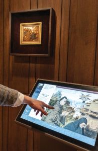
Shoemaker: Content dump: putting all the things you couldn’t get on the label into the interactive media. It’s just more labels, and that’s not the best use of the technology. In art museums, there’s the standard behavior of walk, look, read. How can you break that up with a different kind of experience? Not more to read, not more to learn. We have a new interactive we built with our Jan van Eyck painting, Saint Francis of Assisi Receiving the Stigmata, which is 5 1/2 inches by 5 1/2 inches. It’s an incredible masterpiece and it’s tiny. We built an interactive next to it where you can pinch and zoom. Every age group is enjoying pinching and zooming and being able to see the details, and then looking at the painting and being amazed at how tiny they are.
What are some tips and starting points for a small museum with no permanent collection or interactive media?
Shoemaker: It goes back to being clear about what goals you want to set with each exhibition and if there is an opportunity for some sort of interactive experience. The more clear you are in describing the outcomes—what visitors are going to learn, what this is going to do, how it is unlike anything else—the easier your case for funding.
Tinworth: One thing that’s great about working in the museum field is that we’re pretty collaborative. Reach out to others who may have done similar things, and they will probably share with you. There are so many things that have already been designed or are current ly being designed that might work as a solution for you, so you don’t have to do it yourself.
What can interactives or digital experiences do that analog experiences cannot?
Peterson: Digital touchscreens work well for complex ideas or concepts, helping a visitor discover something. Maybe it’s very linear and you need to walk them through—something that a graphic and label copy are not going to do very well. For the Field’s exhibit “The Machine Inside: Biomechanics,” we built the “Evolution of an Eye” interactive to teach visitors how different eye shapes are built by stepping them through the evolutionary process. Not only are they able to choose and build specific eye types, they are also able to see how light filters through the eyes, illustrating the inner mechanics of how they function. In building specific eyes, visitors get to see a sample list of the animals that have that type of eye—such as a human or a dog or a lizard—and read about how they see. There’s also an opportunity to look across the phylogenic tree and see how surprising it is that very different organisms can share similar eye types. There were a ton of concepts, and we wanted to share them all.
Tinworth: Good technological or digital experiences in museums now do what dioramas used to do. They transport you. It’s this window into a world that you wouldn’t otherwise have access to.
Shoemaker: We’re currently working on a new interactive for a Chinese dragon ceiling. There are only two in the United States, and it’s 20 feet above your head. Our new curator of Chinese art tells us it’s visually fantastic in 10,000 ways. We asked visitors, “What do you want to do?” They wanted a lift, where we could lift them up and bring them down. That’s a mechanical solution that we cannot do. So can technology do that for us? Yes, it can, so we’re inventing a device like a camera through which you can see the whole thing in all its intimate detail.
What are some resources for museum professionals seeking information and funding for interactives?
• Institute of Museum and Library Services (imls.gov): For potential funding for interactive projects, check out the IMLS’s Sparks! Ignition Grants for Museums and National Leadership Grants for Museums.
• Museum Computer Network (http://mcn.edu): The MCN fosters “innovation and excellence by supporting professionals who seek to transform the way their cultural organizations reach, engage and educate their audiences using digital technologies,” according to its website. The MCN-L Listserv is an online discussion list where members and nonmembers can post inquiries about various topics, including interactive media. The annual MCN Conference is an opportunity to learn more about the latest museum technology, with workshops, panel presentations and vendor demonstrations. This year’s conference will be held in Minneapolis, November 4–7.
• Museums and the Web (museumsandtheweb.com): A “collaborative space for professionals creating culture, science and heritage on-line,” as described on the website. An annual conference (next up, MW2016) features “advanced research and exemplary applications of digital practice” for heritage organizations.
• AAM’s Media & Technology (M&T) Professional Network (https://www.aam-us.org/resources/professional-networks/media-technology): The network “strives to identify, access and advocate for a broad variety of uses for media and technology that help museum professionals meet the needs of their diverse publics.” For exemplars in museum media and interactive programs, check out the winners of the annual Muse Awards at the above link.


