This article originally appeared in the July/August 2019 issue of Museum magazine, a benefit of AAM membership.
By most standards, the Smithsonian’s National Museum of the American Indian (NMAI) in Washington, DC, is a wildly successful museum, with a million visitors a year. But when we opened in 2004, many visitors found our exhibitions bewildering, dense, and, worst of all, boring.

since before the country began.
NMAI in Washington, DC, has consistently received lower satisfaction ratings than other Smithsonian museums on the National Mall. This is not acceptable if the museum is to reach its ambitious goal of changing the way Americans think about Indians.
The museum’s most recent long-term exhibition, “Americans,” opened in January 2018 with the goal of reaching visitors who wanted to like our exhibitions (they were in the building, after all) but had left feeling disappointed. The curators also understood that most visitors spend, at best, a half-hour in any single exhibition. Rather than imagine the metric could be reversed, the team embraced it, and we worked to build an impactful experience for people who had just 20 minutes.
The show was conceived to address the most daunting obstacle facing NMAI: American Indians are remote abstractions to the overwhelming majority of our public. Today, most Americans live in urban and suburban areas where Indians are nearly invisible. It’s not that they don’t know or like Native people, it’s that they believe they have nothing to do with Native Americans.
Over time, NMAI staff realized that explaining the harm of US policies or the differences between the Pueblo and the Kiowa has little effect if there is nothing at stake for the visitor. They exit our museums and instantly forget us.
With “Americans,” we gambled on a radically different approach. The curatorial team examined all we had learned since opening our first museum in Manhattan in 1994 and the second one in Washington, DC, 10 years later. We concluded that we needed to show visitors that, in fact, their lives are entangled with Indians. The exhibition had to be about our visitors and the Indians they knew best.

Making Visitors Part of the Story
The defining concept of the show is “Indians Everywhere.” The idea executes a kind of jujitsu, turning the seemingly unimportant Indian images confronting Americans nearly every waking hour into the argument that these images and place names are profound and consequential. They are reminders that the United States is obsessed with Indians and always has been, for the simple reason that the country’s very existence has required the dispossession of Indian nations.
The show is built on this paradox: Indian names and images are etched on the landscape, highways, towns, cities, weapons systems, sports teams, youth organizations, food, cars, and pop culture. Yet this doesn’t quite make sense: Indians are just 1 percent of the country’s population. No other nation has focused so intently on one minority, endlessly reproducing images generation after generation for centuries.
The exhibition is organized to elicit in visitors specific memories they have about this Indian-themed wallpaper—and avoid contemporary culture wars that would make some of them feel guilty or defensive. The idea is to leverage nostalgia into new insights. We believe that unless something is at stake, unless visitors feel they are part of this story, they will never engage with our larger message: that Indians are central to contemporary American life, history, and national identity.
In order to make that message resonate, we had to bring the abstract Indians into the light to reveal how central they are to national identity and psychology. The sports teams and weapons systems are just the tip of an iceberg representing the deep relationship between American Indians and the people of the United States.
The goal, simply stated, is to have visitors thinking about their experience later, to have them realize that their lives are entangled with Indians, that they are part of a larger narrative about American Indians and the United States.
We appear to be meeting our goal, judging from visitor remarks like these:
- “I like that it was presented in a way that you could think about the information. It wasn’t shoved down your throat. I honestly think this [is] one of the best Smithsonian exhibits out there.””
- [Before my visit] I felt that I was seeing American Indians as just victims, kind of. I still see them as victims, but it’s more difficult. I think it’s more complicated…” “
- I went to Hiawatha Elementary School. We had a large mural of a Native American little boy on our gym wall. It never occurred to me to think it was odd at the time. … I would now!”
How We Organized the Exhibition
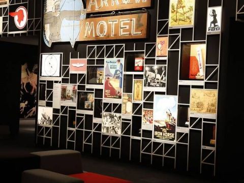
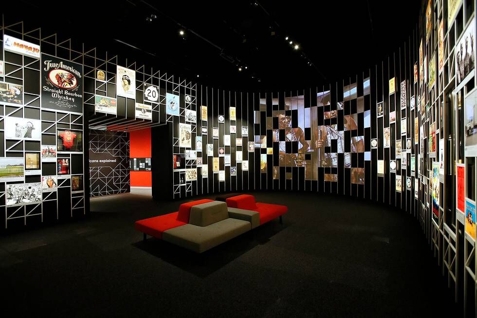
“Americans” is organized around an expansive central gallery, Indians Everywhere. Hundreds of images and objects dating from the colonial era to the present surround the visitor in a dramatic floor-to-ceiling display. The design makes clear that Indian imagery has been a constant backdrop to American life. The quantity and arrangement of the items underscore the extent to which this imagery has influenced the country’s culture. This gallery, which reveals the hidden and not-so-hidden agendas behind the imagery, would make for a compelling exhibition by itself. However, “Americans” needed to go deeper and explain the foundational reasons for the strange national obsession with Indians.
In the three largest side galleries, we explore events in American history that many know something about: the life of Pocahontas, the Trail of Tears, and the Battle of Little Bighorn. In each gallery, we reframe one of the events to focus on how it changed the United States and to explain why it is still in our heads.
We show Pocahontas as a formidable and powerful leader and diplomat whom the country’s founders regarded as key to the identity of the new republic. We show the Trail of Tears, a sad and tragic story about the Cherokee, as the most consequential event between the American Revolution and the Civil War, one that reshaped global economies and has haunting resonance today. We demonstrate how the US Army’s defeat at Little Bighorn in 1876 was the moment the country decided to romanticize and venerate American Indians, and also freeze them in time.
Each side gallery also includes an unusual timeline. It begins when the event ends: What happened after Pocahontas died, the Indians were removed, the battle ended? Here we show how popular understanding of history changes over time. Each timeline presents the various ways that Pocahontas, the Trail of Tears, or the Battle of Little Bighorn has been interrogated, understood, mythologized, debated, and remembered.
The intent is to connect the emotional and visual experience of the Indians Everywhere gallery to the buried history of three iconic events. One explains the other, each is essential.
In the final side gallery, Americans Explained, four panels concisely summarize the reason for the show, the meaning of the title, and the main idea of each historical chapter. The rest of this small gallery is designed to encourage visitor reflection and response: a three-screen video installation shows average people talking about their connections to Indians Everywhere, and visitors can read or write postcards.
How We Designed the Exhibition
“Americans” aims to help visitors understand that the United States has been built on its complicated relationship with Native peoples. From its overall look and feel to each nuanced detail, the exhibition design brings absolute clarity to this idea via layout, graphics, materiality, and architectural vocabulary. The power of Americans’ and Indians’ entangled history emerges from the exhibition’s reduced palette of materials, bold spatial organization, and unexpected use of evocative media.
The radial floor plan situates the historical-event galleries off the central Indians Everywhere gallery. Visitors continually pass through the generous central space as they move among the side galleries. This spatial organization is meant to encourage continued browsing so that visitors will start to see even banal Indian images as indicators of the history explored in the side galleries.

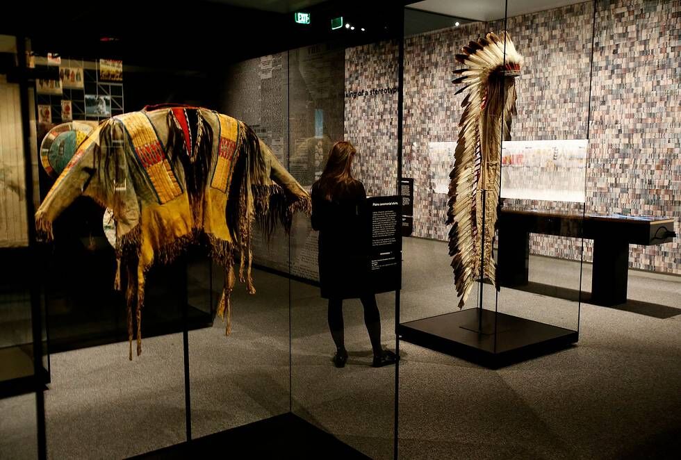
Indians Everywhere is the physical embodiment of the complicated relationship between Native peoples and American culture. In an expansive, geometric armature of white tubular steel (3/4-inch square), nearly 200 backlit graphics, dozens of artifacts, and large-scale objects such as an Indian motorcycle and a Tomahawk missile line the walls from floor to ceiling. Close to 70 television and film clips flicker along the rear curve of the space, while comfortable modular furniture invites visitors to lounge, browse, and chat.
The physical geometry of the display armature in the Indians Everywhere gallery dives into the side galleries and down the entry walls, becoming a bold graphic pattern surrounding pithy, provocative statements. Within the side galleries, this graphic identity of quilted geometry with a modern, sculptural edge is employed throughout. Strongest surrounding the introductory texts and in the custom-illustrated timelines, the effect is dialed back in the heart of each gallery, allowing it to develop its own character.
The exhibition was a risky project. The decision to foreground controversial imagery and objects, and allow visitors to see them without harsh judgment, is wildly out of step with the perspective of some Indian activists and scholars. Some would argue the Indians Everywhere gallery is nothing less than hate speech and has no place anywhere, least of all in a Native American museum. Respectfully, we disagree.
With “Americans,” we choose to directly engage the collective memory of 21st-centuryAmericans because we feel that unless we meet visitors where they are, with humor, surprise and compassion, it doesn’t matter what we say about history or living Native people. Indians Everywhere is a curtain that prevents Americans from seeing Indians, and our exhibition brings that curtain, and those representations, out of the shadows and into sharp relief.
The Critics Weigh In
A wide range of outlets, from the Economist to BBC America, CBS Sunday Morning, and PBS News Hour, have positively covered the exhibition.
Peter Schjeldahl, New Yorker: “I love, and I wish everyone would see, ‘Americans.’ …Apt photographs and entertaining videos abound. So do irresistibly readable texts… I’ll dare to endorse an approach—a specialty of [curator Paul Chaat] Smith’s—that lets identity and politics float a little free of each other, allowing wisdom to seep in.”
Edward Rothstein, Wall Street Journal: “The curators do not preach; they demonstrate, often with good humor. Their goal is not to dismiss but to examine a complex relationship, asserting that we are ‘a country forever fascinated, conflicted, and shaped by its relationship with American Indians.’”
Philip Kennicott, Washington Post: “The museum and its curators have found a voice, and one every museum should emulate: They are going to address difficult questions with nuance and courage…. ‘Americans’ succeeds without being tendentious or bland…. [It has] achieved what so many other exhibitions fail to find: an objectivity that may placate no one but will provoke actual thoughtfulness.”


Comments