As the High Museum of Art prepared to completely reinstall its collection in the fall of 2018, we began talking about how we could use mobile technologies in new and innovative ways to engage the public with our newly installed galleries. We had three goals in mind. First, we wanted to show our on-site visitors the diversity of our collection. Second, we wanted to direct them to artworks they liked so they could experience them in person. And third, we wanted to collect data on our visitors’ tastes.
We planned to produce this project in-house with a zero-dollar budget, and we were encouraged to make it “fun.” Our goal was that it be used by a larger percentage of our public than our previous hand-held technology tools, which were critical successes but did not generate nearly as many downloads or repeat visits as we had hoped. We believe this was because visitors were either unaware of the apps from lack of marketing, or because they were deterred by the need to download and log into them. We wanted to address both of these issues as we worked on this next project.
So, we gathered a cross-section of our staff including curators, educators, marketers, and digital specialists. As this team brainstormed over several months, we started homing in on answering the question we get from visitors every day, “What should I see here?” This conversation must happen in every art museum between guest relations staff and visitors:
Visitor: “What should I see here?”
Guest Relations team member: “What kind of art do you like?”
Visitor: “I don’t know.”
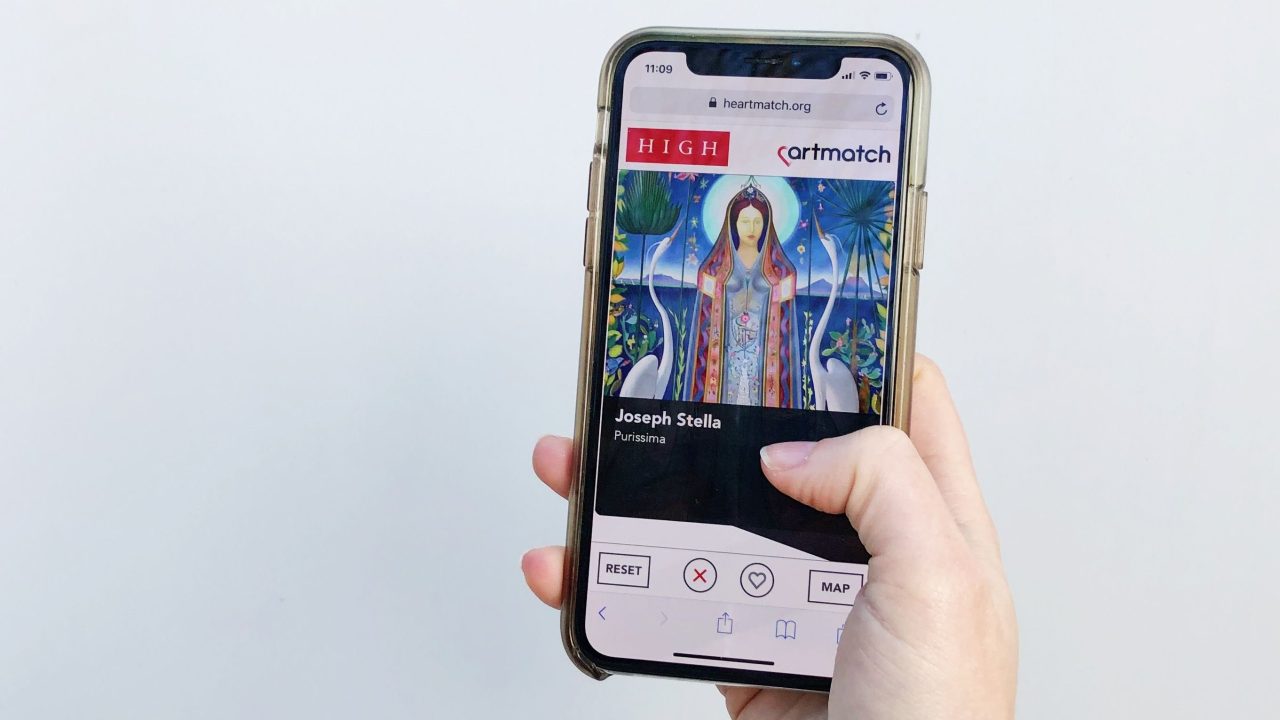
So, we set out to try to help visitors find out what they like. And then in one meeting the magic happened: one of our curators said, “Hey, somebody already figured out how to do this for dating; what if we try to make Tinder for art?!” And so the idea was born for Heartmatch. We were drawn to the simplicity and familiarity of swiping right if you like something or left if you don’t. And once a user had decided which artworks they liked, we could easily save them to a customized map, so the user could go experience the artwork in person. Not only that, we could collect data on our visitors’ tastes. The most popular works could be used in marketing materials, and the least popular works could be used in our educational programming, so we could turn “swipe lefts” into “swipe rights.”
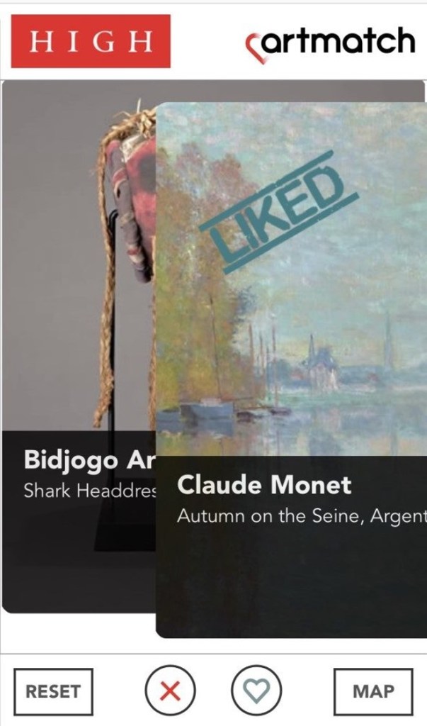
Having outlined our concept, we then had to decide what kind of app to create. Because we felt the login and download requirements of native apps had limited our previous projects, we decided to make a progressive web app instead. Besides forgoing those requirements, creating a web app on simple technologies like HTML, CSS, and Javascript would allow for greater longevity and ease of maintenance.
Our next debate was over how many works of art we should include in the app. How many pieces should we ask a visitor to swipe through? We wanted enough to give them a feel for what we have, but not so many that they would get bored. After some testing, we decided upon 100, which takes less than five minutes to swipe through but still gives our users a good introduction to the collection.
We also had fun coming up with the name of the app. For a while we were calling it “Artmatch,” but as we developed the marketing plan and the language we would use to describe the app to visitors, we decided we would release it on Valentine’s Day with the name Heartmatch.
The experience starts with a prompt explaining the premise of Heartmatch. The prompt asks, “Ready to Fall in Love? Swipe right if you like an object. Swipe left if you don’t. Once you’ve made your selections, view your map and go see them in person.” Then the app presents about 100 of our collection highlights to swipe through. Every seven images or so, a prompt pops up inviting you to see your map of the museum with all of the works that you loved marked on it. From this prompt, you can choose either to look at the map or to keep swiping and add more artworks to it. Users can access the app from anywhere, whether in the museum or at home, and they can email their maps to themselves or their friends if they want to save them for later use. This way, they can pre-plan their visits.
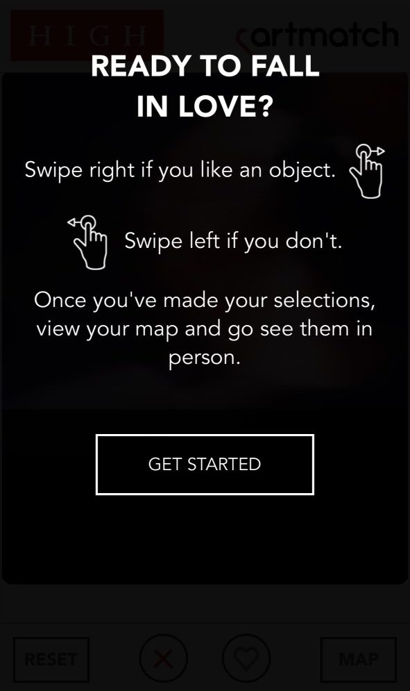
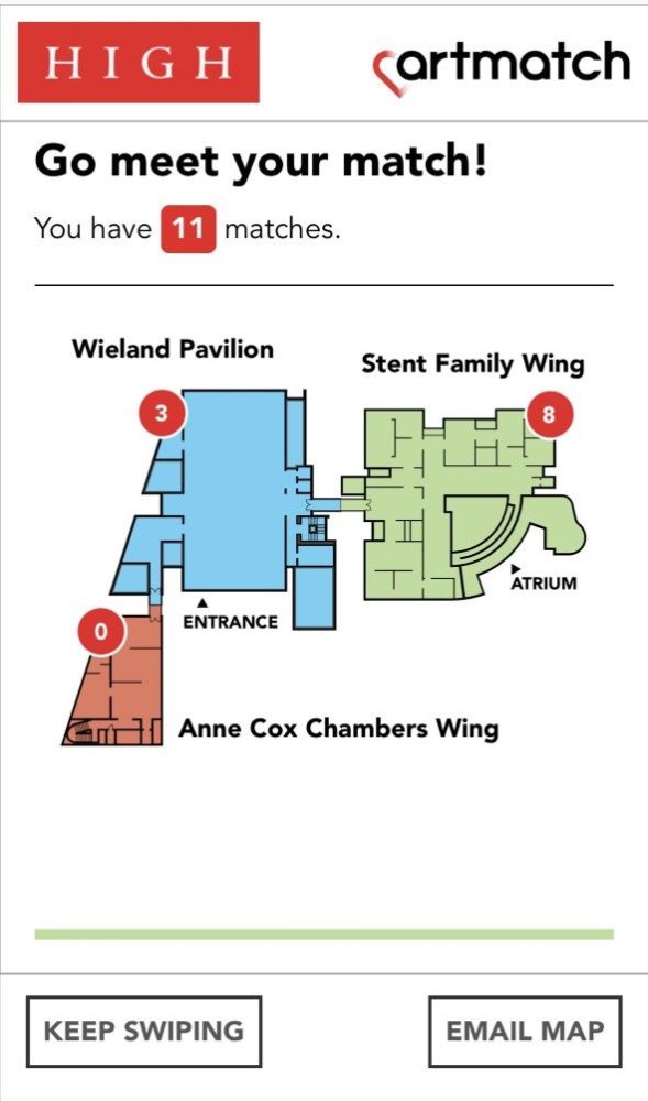
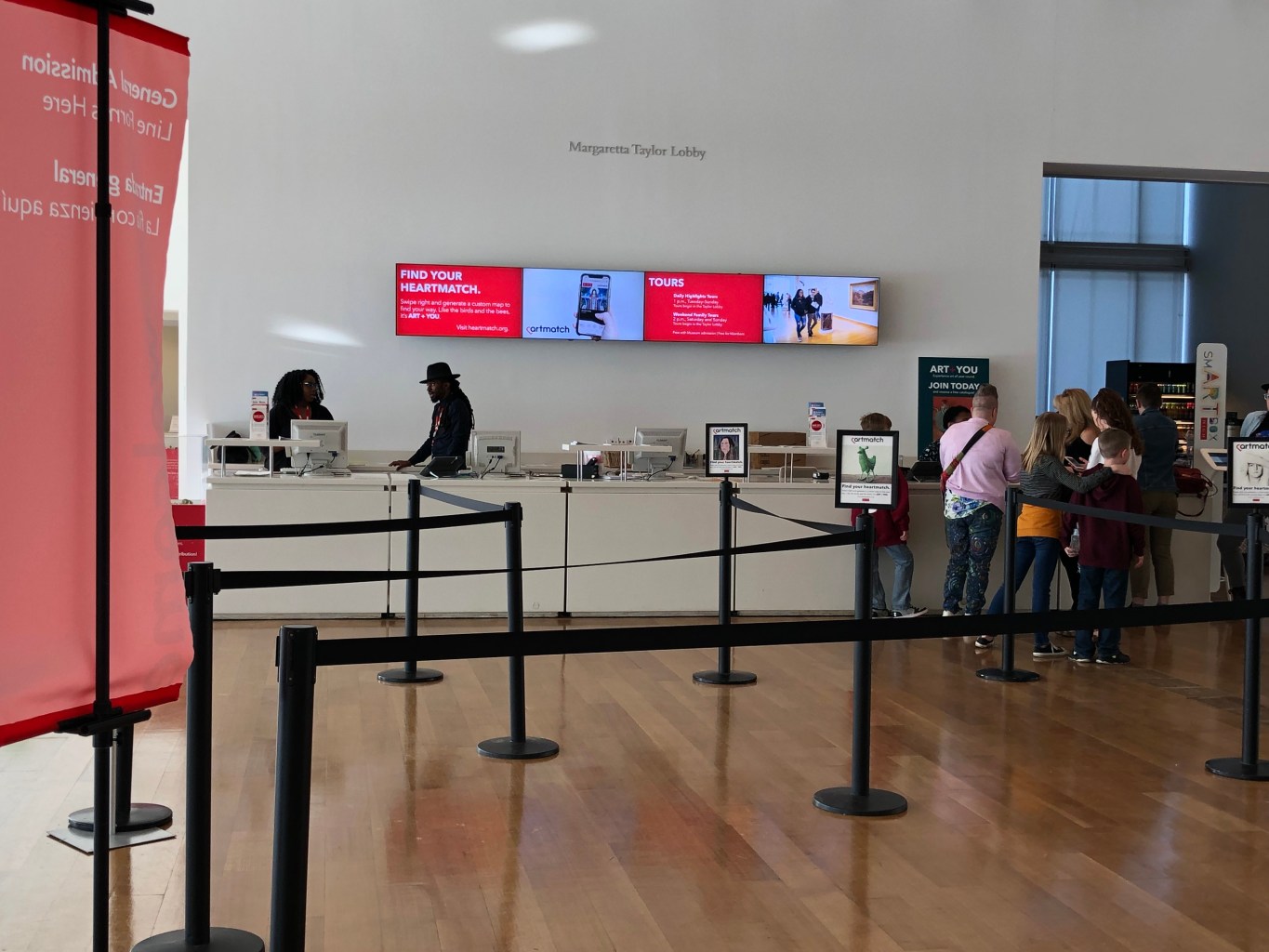
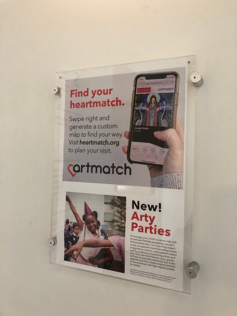
We launched Heartmatch on Valentine’s Day in 2019 to play off the theme of “finding your match” at the High Museum of Art. We had a vigorous marketing plan in place. The marketing team promoted the app as: “Part game, part functional. It’s Tinder, but for art.” Our digital team produced a short video for the High’s various social media channels to generate excitement and show our visitors and members how to use the app. We created business cards for Heartmatch which guest relations, security, and other High staff can hand to visitors as they tell them about the tool. We added promotional signs to the top of the stanchions leading to the ticket desk, so visitors encounter Heartmatch as they wait in line. We also placed posters for the app in the stairwells and elevators inside the museum, and added a prominent link to the visit page of our website, which generates at least half of the traffic.
Now that Heartmatch is launched, we are conducting a summative evaluation to see how our patrons are actually using it. It is a two-part survey which takes about ten minutes to complete, and includes both observation and a post-activity interview. We are still in the early stages of surveying, but we are already getting useful responses. These responses will help us gauge where Heartmatch will take us in the future.
About the authors:
Julia Forbes is the Shannon Landing Amos Head of Museum Interpretation and Ivey Rucket is the Manager of Web and New Media, both at the High Museum of Art in Atlanta.


