Generally speaking, children are much more enthusiastic about heading to a children’s museum than school, even though learning occurs in both places. Visit a children’s museum any day of the year and you can literally see their excitement from the moment they enter the building. They are fully immersed in the experience, fearlessly trying new things and asking great questions.
To explore the physical and experiential reasons behind this difference, a school district outside Pittsburgh is embarking on a novel kind of K-6 school project. The Seneca Valley School District’s project is a partnership between a design firm, CannonDesign, and the Children’s Museum of Pittsburgh, to collaboratively explore how schools can better emulate children’s museums. The partners were equally invested in engaging stakeholders, exploring design possibilities, and shaping the building. Specifically, they asked, how can learning spaces be more compelling, relevant, engaging, and successful for students? And, do enriched learning opportunities emerge when teachers and students are empowered to curate their school spaces and experiences?
The school won’t officially open until Fall 2022, but the design is finished, and the strategies identified through the partnership introduce no added costs—proving any school can incorporate similar creative environments without budget challenges. The project has shown that blurring the boundaries between museum and learning environment design can lead to otherwise undiscovered positive potential and results. Museum leaders and designers should be encouraged to connect with PK-12 education and continue to shape new solutions.
Here’s a look at five key takeaways from this unique partnership, which other museum leaders could help infuse in their local school districts.
1. Never Waste the Walls
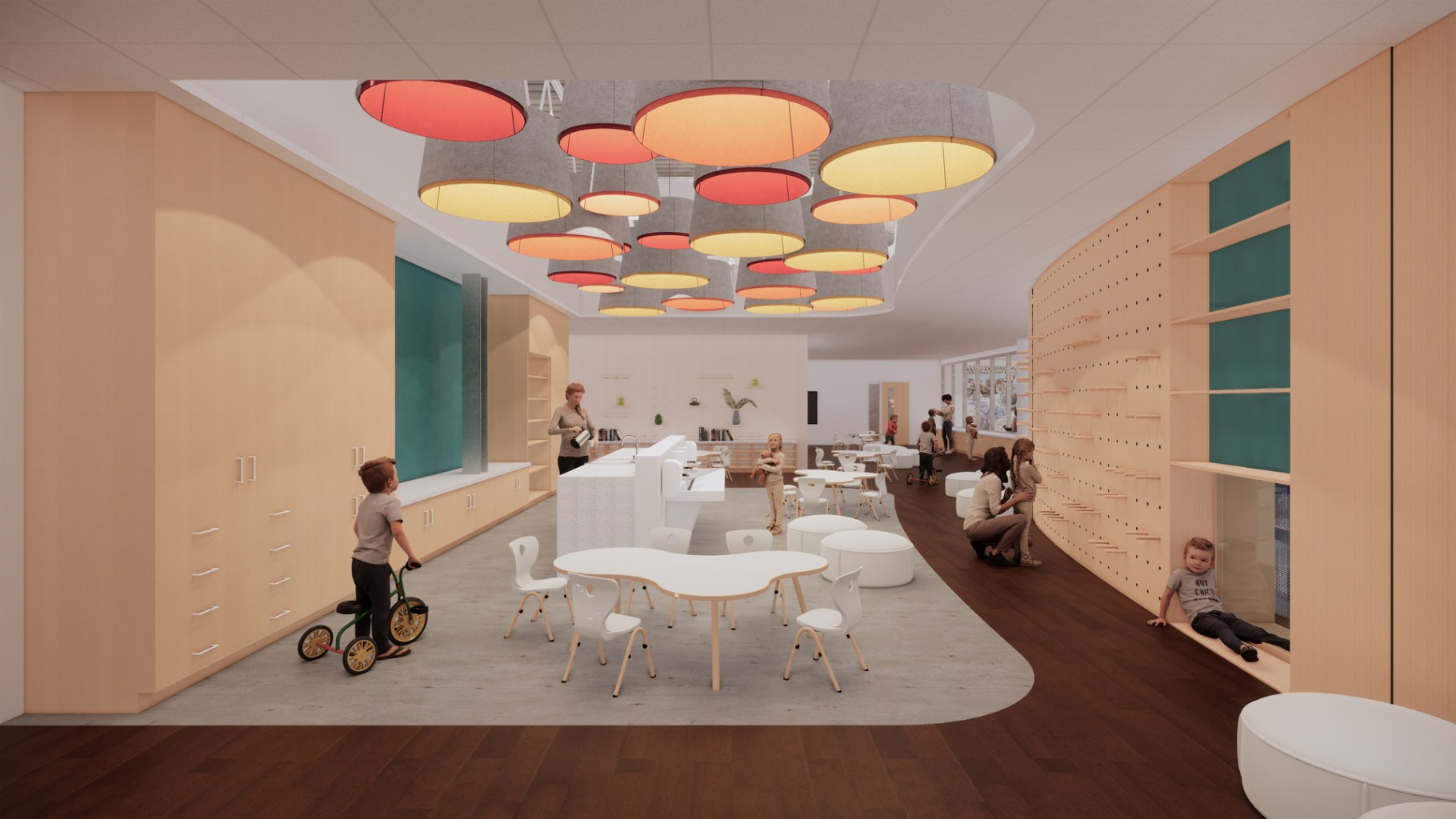
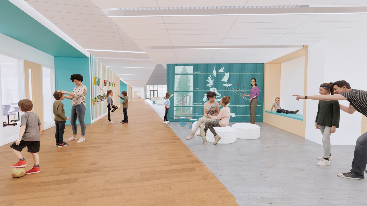
One striking difference between PK-12 schools and children’s museums is how they treat wall space. In school environments, corridors are almost always static, left blank, or used solely to display student work. In museums, however, wall spaces are leveraged as teaching tools, where children can engage, experience, curate, and more for dynamic learning opportunities.
The Seneca Valley PK-12 project embraces museums’ approach to wall space, featuring:
- Graphic walls that teach children about animals, plants, counting, earth sciences, ecosystems, language, and more based on their location relative to grade level
- Peg boards where students can cognitively and physically engage in analog and/or tactile learning activities like scatter plotting, pattern forming, recognition, and deductive reasoning
- Large-scale magnetic wall maps documenting data like ecological surveys of the surrounding site
- Harmonics walls which create learning opportunities related to sound, distance, fractions, energy, and more
“Recognizing that walls, both inside and outside of the classroom, are learning tools proved to be one of the first and most important opportunities we discovered as a team,” said Anne Fullenkamp, Senior Director of Design at Children’s Museum of Pittsburgh. “Considering empty walls as important spaces gave us more opportunities to develop another layer of tools that gives agency to students and teachers to be curators of their environment: it’s an idea every school district should embrace.”
2. Encourage Students to Take Physical Journeys
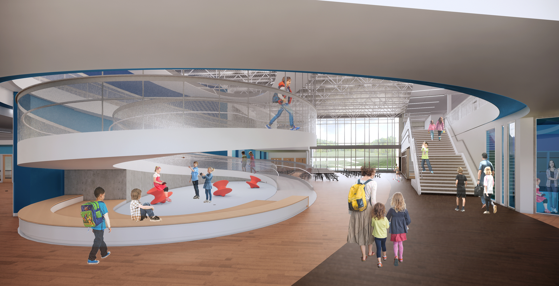
Compared to schools, children’s museums are much more intentional about designing the whole environment to encourage physical movement, social interaction, and connecting with the mind and body.
There are numerous ways PK-12 schools can emulate such movement-fueling design strategies. For example, rather than a standard staircase between floors, consider a spiraling or parabolic ramp that allows for different routes, views, and perspectives of the schools (not to mention more fun!). Or decorate the floors with graphics that are both educational and narrative, compelling students to joyfully move forward to new classrooms, spaces, experiences, and opportunities.
“I think the fundamental difference is traditional school design assumes students start learning when they get inside a classroom, where museum design sees the entire building as part of the experience with learning happening as a journey,” added Fullenkamp. “There are a lot of positives that come from this journey approach and it’s exciting to see this school adopting it.”
3. Be Nimble and Adaptable
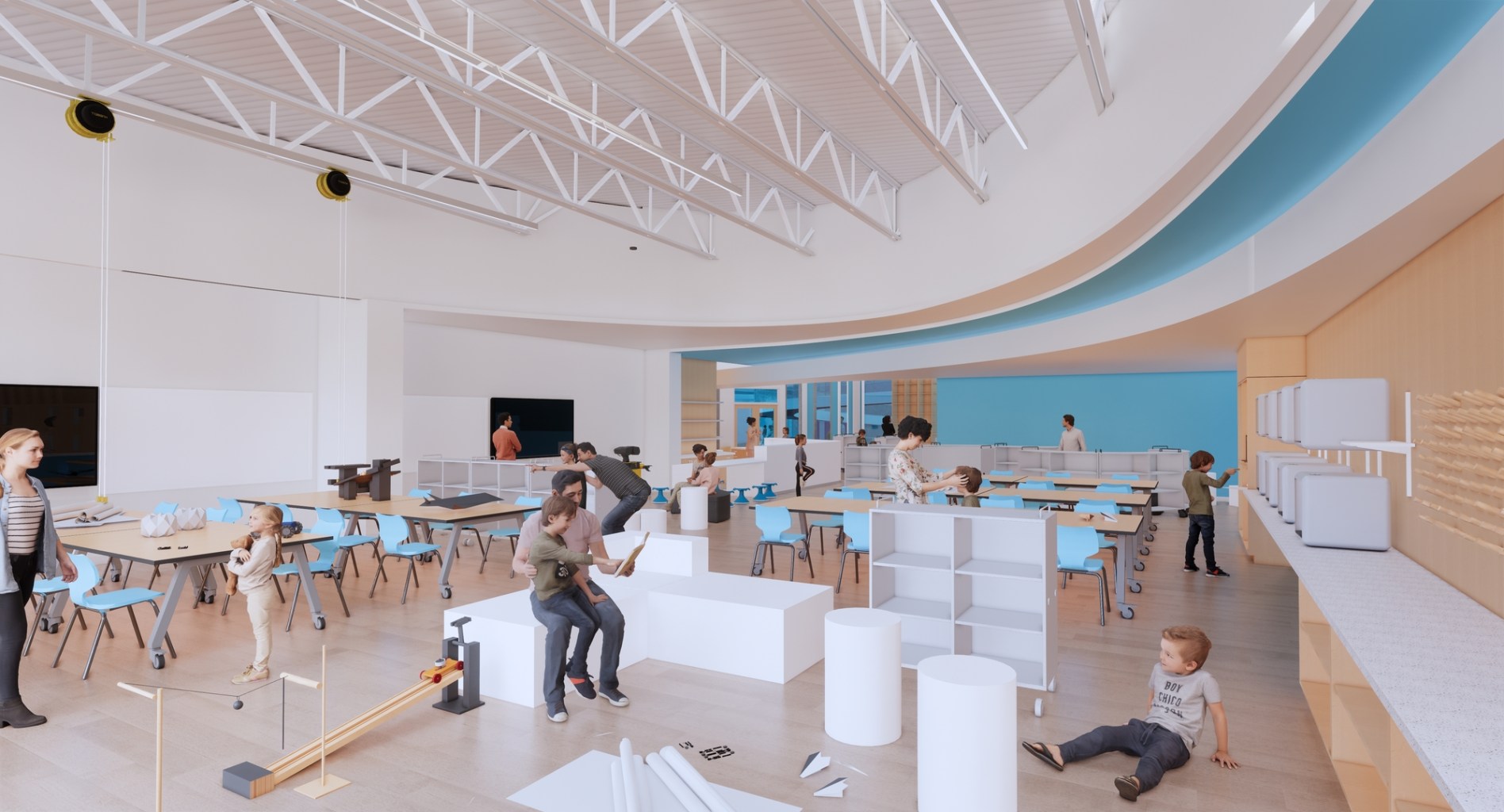
Both PK-12 and children’s museums are non-profit institutions that often have limited operating budgets. Therefore, it is key to design spaces for them to be nimble and adaptable. For example, at the Children’s Museum of Pittsburgh, many of the walls and space dividers throughout the building are clad with interactive peg wall systems that let curators change exhibits and activities easily over time.
This approach can empower schools to create more long-term sustainable spaces. Through the example of museums, PK-12 teachers, students, and staff can find new ways to repurpose what they have and use areas in new ways as needed over time. Once design teams look at materials not just for their utility as a building material, but also as a responsive surface, they will recognize simple interventions—like using perforated metal guardrails instead of flat panel, so students can use it as a canvas for fiber art—can have a big impact, and the opportunities become almost boundless.
4. Use the Environment as a Teaching Tool
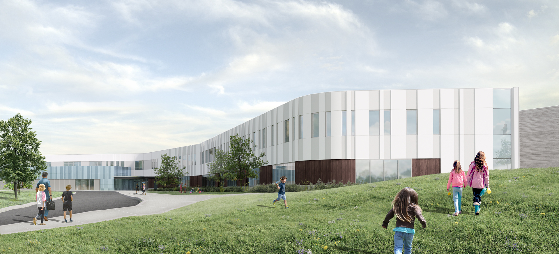
In discussions between the collaborative team, it became clear that children’s museums are also more intentional about using the natural and physical environment as teaching tools. Schools are often more focused on serving as a conduit, routing people across different points during the day. If they look for ways to integrate their outdoor and indoor settings, students can more readily take new studies around a subject like how plants grow and nourish their surrounding environment.
Here are a few ways the Seneca Valley project builds on this concept to enrich education:
- Exterior glazing on windows to vary daylight reflection and allow for student comparisons of low-e coating and shading films
- A green roof deck with sedum plants and PV panels for teaching green technologies, an Aquaponics lab to teach sustainable food and plant production, and rain chains to teach about stormwater impacts to ecosystems and municipalities.
- Transparent layered walls to help explain building construction assemblies to students
- Visible mechanical rooms with illuminated side light displays and interpretive graphics to teach condensation, evaporation, and the energy and environmental impacts of artificially heating and cooling interior spaces.
These strategies rely on the students’ environment to educate and can be amplified through creative partnerships.
5. Break up Building Scales
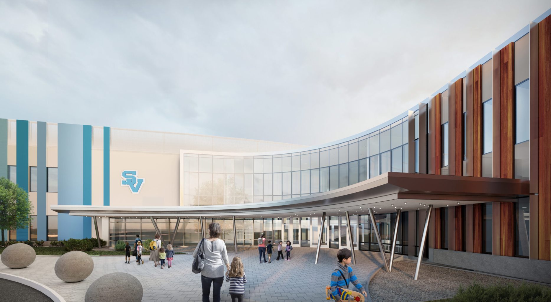
Part of bringing more joy to the school experience is designing the shape and scale of its building to be inviting. Many schools follow traditional, institutional design strategies, which can be ominous for students.
Museums tend to do a better job of breaking down the scale of the interior to create more welcoming, inspiring, and inclusive environments. They’re more likely to embrace a design strategy that makes the big feel small, through a balance of community spaces and areas for individual learning. Effective scale can also help schools better connect students to surrounding natural environments.
As one example, the Seneca Valley project ensures the kindergarten suite is an enclosed loft on the second floor with dedicated access routes to a roof terrace play garden. The access point is near the school’s main entry and via the parabolic ramp, ensuring playful, dynamic routes. These simple structure and design measures help ensure the school experience is as welcoming as possible for its youngest students.
Across the design world, boundaries are being blurred between typology design. Just as learning assumes different forms, so too should school design responses. Museum leaders and museum designers should welcome this shift and feel encouraged to reach out to their education partners to inspire more joyful, engaging, and effective learning spaces for future generations.
About the authors:
Michael Corb (Education Market Leader and Education Planner) and Troy Hoggard (Design Principal) are key leaders for CannonDesign, an integrated living-centered design firm focused on helping people flourish. Both Mike and Troy have been key to the design of Seneca Valley’s new K-6 school set to open in 2022.

