This article explores ten high-impact areas you should consider to enhance your website’s accessibility and bring it into conformance with the Web Content Accessibility Guidelines (WCAG), the set of rules and practices that aims to define web accessibility. In this context, the word “accessibility” means that users of assistive technologies (such as screen readers, zoom/screen magnifiers, voice dictation, and more) can use your website, because it has been built in a way that provides an equitable experience for all visitors, including those with disabilities.
Implementing the following advice drastically improves the accessibility of a website, but it is important to note that these are not the only steps necessary for conformance. There are best practices around content, design, and coding not covered by this article or WCAG that are equally essential for creating an equitable and enjoyable website experience for all. The following suggestions are not exhaustive, but support museums in making strides towards creating inclusive online offerings.
Because decisions across the museum affect accessibility and inclusion, this advice should be consulted by those in various areas of practice. The people who may benefit the most include webmasters, designers, developers, content creators, third-party agencies, and those who manage any of the above.
Before we dive into the list of suggestions, it is important to be aware of a type of product out there called an accessibility overlay. These overlays are often sold to website owners under the false promises of achieving accessibility conformance automatically through the use of a JavaScript include. Please do not consider any such product at any price point. They often do more harm than good. Lainey Feingold, the best accessibility-focused attorney of our time, has an excellent post explaining why accessibility overlays don’t work and do not even protect you from lawsuits.
1. Write alt text for images.
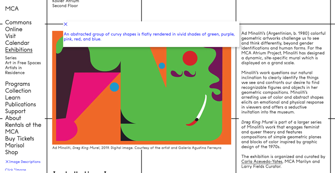
“Alt text,” short for alternative text, is an HTML attribute where you can provide a textual description of an image for those who may not be able to see the image for a variety of reasons. All images that appear as meaningful content on a museum website, such as those on collection sites, event photography, and gallery imagery, require a visual description for a website to be considered accessible.
For a wonderful overview of visual description practice at a museum, the Cooper Hewitt guidelines should be consulted. Additionally, this article on the process and contextualization of visual description practice is a fantastic resource.
It is important to note, though, that not all images count as meaningful content and need to be described visually. This applies especially when images are used as a link, button, or other interactive control. In utilitarian uses like these, the alt text must instead be a concise and accurate label. For instance, if you use a picture of a restaurant menu as the icon for your café, the alt text of that picture should almost certainly be “café menu,” rather than something descriptive like “a leatherbound restaurant menu featuring stylized writing.”
2. Use heading levels on text.
Heading styles are incredibly powerful when used correctly. They convey the information hierarchy of your content to everyone, not just those using assistive technologies. But for headings to be accessible, they need to be distinguished not only visually—i.e., with color, emphasis, and size—but in the code of the page as well. To do this, you use the heading tags in HTML. Heading levels span from one (<h1>) to six (<h6>), with one being the most general level and six being the most specific. Put another way, if you think about a book, the title would be your level one heading, each chapter title would be your level two, section titles within chapters would be level three, and subsection titles within those would be level four. On a museum website, an information page might have a level one heading like “Plan Your Visit,” with level two headings like “Ticket Information,” “Getting Here,” “FAQ,” and so on.
Using proper headings like the above is critical for screen reader users to be able to efficiently navigate your website, because the screen reader will provide the option to quickly scan over a given page to choose which portion to read. This enables the equivalent of skimming a webpage, jumping over areas not of interest and focusing in on what matters. Sighted users can do this easily through the visual hierarchy being represented through styling, quickly glancing at a webpage, and navigating through the various visually distinct sections. Screen reader users can perform this same behavior if headings are coded correctly.
3. Caption, transcribe, and describe videos.
Before we get to specific recommendations for time-based media like videos, we must first get on the same page about a few definitions. The below definitions are taken from the Mozaic Inclusive Design Glossary.
Sign Language
Sign languages (also known as signed languages) are languages that use the visual-manual modality to convey meaning. Sign languages are expressed through manual articulations in combination with non-manual elements. The official working language of the American Deaf community is American Sign Language (ASL). This language has equal status and priority within the National Association of the Deaf and its activities.
Subtitles
Subtitles are a translation affordance for a visitor. They are offered when the language of the viewer differs from the language of the media. For example, if a video is in German, English subtitles should appear on screen for English speakers. It is important to understand that subtitles are not captions. In addition to being in a translated, and therefore different, language than the source media, subtitles do not indicate non-speech audio such as sounds, music, and more.
Captions
Captions are the real-time textual representation of what is being said as well as any non-speech audio. If English is being spoken or if any sounds occur in a video, English words appear as a textual alternative to the audio. It is critical to understand that captions are not subtitles. Captions are displayed in the same language as the language of the media.
Closed Captions
Closed captions are the form of captions that are not burned into a video. This means they are stored digitally as text, either in a separate file from the source media or as part of a container format. They are preferred because they can be read by screen readers—think of a deaf-blind individual accessing captions via braille.
Open Captions
Open captions are captions that are burned into the video. They are not stored as text, but as pixels that comprise the frames of the media instead. They are not preferred in most situations (see Closed Captions), but they are sometimes necessary—think of an uncomplicated video playback device in a public setting that does not support closed captions.
Transcripts
Transcripts are the static textual representation of the source media. It is convenient and accurate to think of a transcript for a piece of time-based media as a concatenation of all the captions of that media. Transcripts can be consumed at an independent rate of speed from the source media, as they are static text.
Audio Description
Audio description is an additional audio track, often phrased as an additional language track. Just as captions are in the same language as the source media, so too is audio description. Audio description is the narrated visual descriptions of the contents of the source media. The style and amount of audio description is heavily dependent upon the source media’s contents.
Audio Ducking
Audio description is often delivered via audio ducking, a simple acoustic treatment easily achievable in virtually all editing workflows. Audio ducking is when the source audio is lowered but not eliminated, and the audio description track is played at the source media volume. The audio of the source media is said to duck underneath the narration of visual description; hence why it is called audio ducking.
Recommendations
All videos must come with captions and transcripts. But, as the definitions above indicate, captions are not the same as subtitles—they provide a textual representation of both spoken and non-spoken audio. It is important to understand the difference.
Most videos must also come with audio description. Sometimes the content of a video might be sufficiently described by the audio, such as a simple “talking head” where visitors can determine who is speaking by the information surrounding the video on the page. But even in those situations, audio description is often important, as the person talking may have salient facial expressions or other body language that is necessary to convey to an eyes-free audience.
ASL is an excellent affordance to offer because it is a truly inclusive experience for ASL users. Remember that English is not the primary language of your ASL-using audience—ASL is. So, just how you may offer Spanish for a Spanish-speaking audience, so too should you offer ASL as a form of equitable welcome.
4. Watch for color and contrast.
Because not everybody can perceive color, information must never be conveyed through color alone. For example, if an error message on a form displays missing fields in red when the user has not provided all of the information they are prompted for, the color change must be accompanied by a non-color-based means of expressing the same information, such as a textual message. Think of the forms on your website involving email signups and the like. Do they all convey errors in this inclusive fashion? Also think about any graphs or charts. Is the information in any such infographics understandable without the ability to perceive color?

The contrast between colors is also a critical aspect of facilitating an accessible experience. Think about how difficult it can be to read small gray text on a black background, for instance. If a visitor to a website has low vision or any type of color processing difference, then that effect is magnified. To account for this, WCAG lays out a color contrast requirement: small text must have a contrast ratio of 4.5:1 and large text must be at least 3:1. You can find tools which will measure and report these numbers for you. It is important to make sure that such tools are doing pixel-based analysis, though, because otherwise the reported values will be inaccurate.
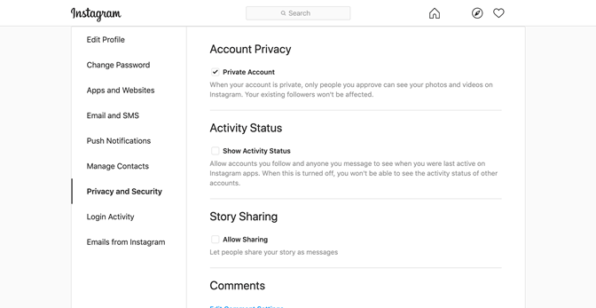
Even though the Wave browser extension, which you can install and run on any page of your choice, is not pixel-based, it is useful for a preliminary check. Using a page on Instagram as an example, we can see the extension reports twenty-four color contrast violations. For pixel-based analysis of color contrast issues, the Color Contrast Analyzer for Chrome is a useful browser extension to install.
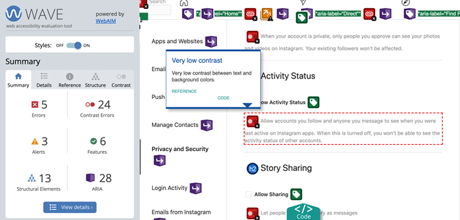
Another way of gaining insights about these issues is by enabling “high contrast mode” in your phone or laptop’s settings, then visiting the page you want to assess. Look through and ask yourself: are you still able to fully understand what is being presented?
Selecting colors with careful consideration to potential contrast implications, rather than checking post-facto, is an excellent way to avoid costly or highly visible remediation down the road. Many organizations benefit from building such considerations into the design and development of style and branding guides.
5. Label controls well.
Imagine a button on your page with a rightward-facing arrow. For a sighted audience, it might be clear what the button does, but screen reader users, as well as many others, need an explicit label in the code to understand what it means, such as “Next.” This labeling, called “programmatic labeling,” is incredibly important, because without it assistive technology users may have no idea what various controls on the website do. Imagine being on a form where you have spent a lot of time filling out information, then getting to the end where there are two buttons that say “Save” and “Cancel.” If these buttons do not have accessible labels, how do you know, as someone who cannot see them, which one to activate? This is a needless level of frustration that we can avoid by simply following proper labeling practices within the code. While the use of the title attribute is recommended within that labeling practices article, it is critical not to use the title attribute.
Regardless of the capabilities built into web and assistive technologies to support invisible or programmatic labels, it should always be a goal of any design system to surface labeling information in a visible and permanent way to achieve a more inclusive experience for everyone.
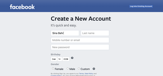
Another thing to consider is how labels that are visible to everyone are displayed. For example, on forms with labels like “First Name” and “Zip Code,” it is common for certain inaccessible designs to use placeholders—i.e., the label appears in the field when blank and disappears after you begin typing. Instead of this, we should always make labels persistent. Imagine a website with a placeholder label on an input field. If the user has begun typing but then gets distracted or interrupted while completing the form, then it is quite difficult to know what piece of information that input field was asking them. There are numerous ways of achieving this without negatively impacting design.
6. Make your site zoom-friendly.
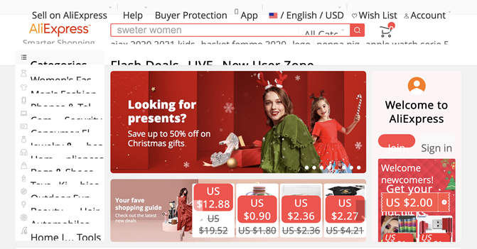
To be accessible, your site should behave well when zoomed in to at least 200 percent. Responsive design, where page elements shift to accommodate the size and shape of the browser window, goes a long way towards addressing this concern. One thing to pay close attention to is that there is a difference between text-based zoom (where the images are not magnified) and optical zoom (where everything is magnified). It is important to make sure that the website works well with both kinds of zoom, especially text-based zoom, because that is where many layout and design bugs arise.
7. Make controls accessible without a mouse.
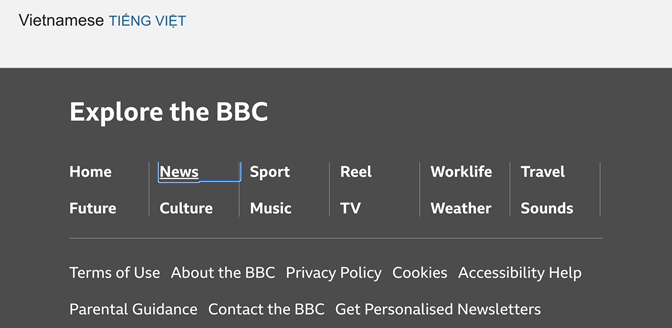
On an accessible site, users must be able to reach all interactive controls without the use of a mouse (for example, through keyboard navigation). Additionally, there must be a clearly visible indication of the user’s current “point of regard,” the place on the page where they are focused. For example, this might be an outline that appears around items in a navigation menu to convey which one the user is currently focused on. Note, as a concession to design concerns, that it is possible to make it, so such focus outlines and underlines are presented only when the tab and the shift+tab keys are pressed. This allows strong focus outlines for users navigating with a keyboard without affecting the styling for mouse users.
8. Label and style links clearly.
When hyperlinks appear on text in the middle of passages, the text must accurately describe where the links go. For example, “Our Summer Schedule” is great link text as it is descriptive without the surrounding words being necessary, while text such as “Click Here” or “Read More” is ineffective because users can only determine its meaning by activating the link.
It is also important to make sure that links are clearly visually indicated. One easy way, which has existed since the first days of the web, is to follow the established practice of underlining text that is a link and not disabling this styling for design reasons. There are ways of enhancing link styles so that they are both aesthetically pleasing and accessible.
9. Specify the page language in the code.
To enable appropriate speech and braille output from screen readers, developers must specify the language of a page in the code, as well as the language of any constituent passages or phrases if they differ from the rest of the page. Listening to text in a different language than the one a speech synthesizer is set to can be incredibly frustrating. That is what happens when developers leave off just a few characters of code on the page. It is one of the easiest things to get right, but when it is left off, the effect can be complete incomprehensibility of all the content on the page.
10. Validate your code.
It is critical for developers to validate all mark-up against the W3C’s HTML5 and WAI-ARIA specifications, using the HTML5 and ARIA-aware validator. This is essential because even if you are mindful of using the appropriate accessibility attributes, they can still have little or no effect if there are parsing or other issues in the code which prevent the page from being rendered as intended.
Think of the validator as a spelling and grammar checker for your website. It will not catch most semantic errors (i.e., if you are using a word wrong), but it ensures the code is at least written without syntactic mistakes (i.e., at least it is all spelled correctly). Validation is necessary but in no way sufficient to ensure accessibility.
Conclusion
While the above best practices are essential for users of assistive technologies to use a website, many of the benefits will extend beyond them. For instance, mobile users benefit just as much from the ability to zoom in on pages and navigate without a mouse. Proper use of headings is instrumental for a good information hierarchy in general, not just facilitating access for screen reader users. Addressing accessibility issues, in addition to the operational and inclusivity benefits, also improves search engine optimization (SEO). By taking a few intentional measures towards improving the accessibility of your website, you will see improved usability and performance of online offerings for all visitors.
While the above recommendations are in no way exhaustive, they are entirely achievable by cultural organizations of all sizes, with some deliberate effort. As institutions within the public trust, there is an ethical mandate for museums to take on this work.
I hope the above proves useful and actionable. As a screen reader user, I can’t wait to explore your more accessible and inclusive websites. Thank you in advance for your efforts in building a more inclusive web.

