
This article originally appeared in the July/August 2021 issue of Museum magazine, a benefit of AAM membership.
An exhibition at the Children’s Museum of Pittsburgh uses the movie Inside Out to teach children about their feelings.
In 2016, the Children’s Museum of Pittsburgh (CMP) partnered with Pixar Animation Studios to develop the first interactive exhibition based on the award-winning film Inside Out. In the film, five emotions—personified as the characters Anger, Disgust, Fear, Sadness, and Joy—wrestle for control of the mind of 11-year-old Riley as she navigates the challenges of growing up and the emotional tumult that comes with it. While Riley may be the main character, the emotions are the stars, specifically Joy and Sadness, who lead audiences on an adventure about the important role emotions play in our everyday lives.
We saw the project as a platform for merging the art and storytelling presented in the film with hands-on activities that would add new dimensions to the story’s emotional themes. After months of prototyping, working with our advisory panel of experts in social-emotional learning for children, and watching the movie many, many times, we distilled the major messages of the film to the following three exhibition goals: 1) help visitors identify their own and other people’s emotions; 2) equip visitors with a deeper knowledge of how emotions and memory “work”; and 3) encourage visitors to explore the role that imagination and storytelling play in helping us process our experiences.
The result was Emotions at Play with Pixar’s Inside Out, a tactile, interactive exhibition that lets the audience live in their favorite parts of the story and learn to recognize emotions in themselves and others with the characters they know and love. We developed the activities using the film’s storylines as entry points for visitors to have deeper, more personal conversations about their own emotions and memories.
The Partnership
This partnership developed as many of ours do—from a conversation between friends. In this instance, our executive director was talking with people in the education department at Pixar Animation Studios about the CMP’s recent work about emotions, specifically our traveling exhibition “XOXO: An Exhibit About Love & Forgiveness” and our research project on the subject of kindness.
We wanted to develop more exhibitions that would let us build on this previous work while also challenging ourselves to go deeper into social-emotional topics. Pixar’s education team saw a connection between the emotional themes we were exploring and those presented in Inside Out, so they introduced us to the film’s creative team with the idea that our shared interest in making emotional experiences more playful and accessible to children and families might turn into a compelling exhibition.
Pixar had a history of developing large-scale traveling exhibitions about its work, but it hadn’t developed anything specifically for children based on a single film. For this project, the company was interested in a smaller-scale exhibition that could be hosted by a wider variety of venues in order to serve more communities and reach more children. CMP had developed six traveling exhibitions of this scale and scope since 2014, so this project was a good fit for us.
After a discussion on our respective goals, we found that our design approaches aligned as well. Both creative teams had a highly collaborative and iterative design process, which helped us envision how we could work together to develop the exhibition. We formalized the partnership in late 2016 and got to work.
The project developed over the next three years with the exhibition on track to open to the public in September 2020. In addition to regular review of design drawings and project briefs, prototyping was at the core of the design development process. Prototypes were built and tested at CMP with visitors and advisors providing feedback. Extended sessions were scheduled when the Pixar team was on-site in Pittsburgh, allowing all parties to see how the exhibits were performing in real time with kids in a real museum setting.
However, COVID-19 interrupted our plans when we closed to the public on March 13, 2020. We were headed into our final round of prototyping at the time, with much of the exhibition designed and ready to be built. Luckily, the project was far enough along that we were able to continue with the final fabrication, meeting regularly with our partners in California via Zoom as we built fixtures at our facilities in Pittsburgh. We completed building the exhibition in fall 2020 and installed it in our Traveling Gallery that December. The exhibition premiered at CMP on June 12, 2021, when the museum reopened to the public.
The Exhibition
The exhibition focuses on three themes—identifying emotions, emotions and memories at work, and imagination and storytelling—all of which are rooted in specific narrative points from the film. Within this framework, we made the exhibition as open-ended as possible, so visitors can either insert themselves into the story or create their own stories based on their life or imagination. Much like Pixar’s creative team did with the film, we designed the exhibition with children in mind but made sure the experiences were relevant to adults as well.
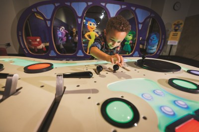
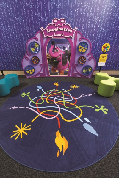
In the film, there are two settings: the human character’s real world and her mind world where her emotions live. We decided to present only the mind world, to make the exhibition experiences broadly relevant to visitors of all ages. This meant we designed the exhibits around the key places featured in the mind world—Headquarters, Dream Productions, Imagination Land, and Long-Term Memory—thus establishing a strong sense of place. We recreated iconic settings from the film by reimagining the art direction and design elements from the animation for the museum’s physical space and in-person experiences.
Likewise, we focused on the five emotion characters that live in the mind world, Anger, Disgust, Fear, Sadness, and Joy, as well as Riley’s imaginary friend, Bing Bong. We did not include Riley, the human character in the film, in the exhibition because her real-life experiences were very contextual and specific to her. Instead, we focused exclusively on the emotion characters because they provided a better platform for a broader discussion about emotions in any context.
To reinforce the identities of the five emotions, Pixar’s creative team color-coded the characters, linking each emotion to a signature color: Joy is yellow; Sadness is blue; Fear is purple; Disgust is green; and Anger is red. We mirrored this color language throughout the design to make it easier for visitors to associate the characters and their respective color in the film to the activities in the exhibition.
We knew visitors would recognize the visual elements in the exhibition, but we needed a way to ground these concepts into constructs that were tangible and relatable for children. We did this by tapping into the film’s narrative of “work,” in which each emotion has a different “job” and no one emotion is more important than the other; they all need to work together for us to be emotionally healthy.
We conveyed this interplay through activities that use balance, reflection and communication to demonstrate how different emotions, even ones that may be polar opposites, are connected. For example, visitors can balance their bodies by walking along a web of colorful, intertwined paths; act out their own emotional stories inspired by a series of movie posters, each featuring one of the emotion characters; or look into a special mirror that can gauge the range of emotions in their facial expressions. These activities were designed to encourage collaboration and group play, demonstrating that emotions are not isolated and working together can produce different emotional outcomes.
The Design Intent
We envisioned the experience as a collection of open-ended exhibits where visitors could enter the story at any point and have unique experiences multiple times. By creating a nonlinear, multilayered experience, visitors would have the opportunity to bring their own specific narratives to the exhibition and deepen their awareness and understanding of emotions as complex, mutable, and subject to interpretation.
To achieve this, we played off the film’s emotive art direction and dynamic visual language to provide enough context and detail to activate the “mind world.” While we wanted to immerse visitors in the “real” places from the film, we did not want the settings to be prescriptive. Instead, we wanted to create a space where visitors could recall and reimagine personal stories that were the most meaningful and memorable to them.
For example, when we designed Headquarters, we emulated the shapes and colors from the film to build a life-size version with the windows as interactive mirrors and the control panel as a multisensory instrument equipped with an eclectic collection of buttons, levers, and dials. The exhibits place visitors physically in the story without confining them to a specific storyline.
Once we set the scenes for the storytelling, we could design the exhibits as jumping-off points for more personalized experiences. For us, this was key for supporting the emotional content because it left room for the audience to make their own meaningful connections to the activities.
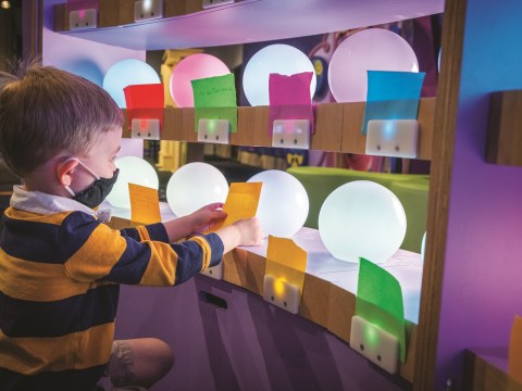
In addition to the pretend play experiences that invited visitors to insert themselves into the storytelling, we developed a writing activity called “Memory Orbs” in which visitors share their personal memories to “turn on” the exhibit. Inspired by the film’s depiction of how emotions can change memories, visitors recall an important memory and how it made them feel and then write it on a colored piece of paper; the color of the paper matches the color of the associated emotion. Next, they place the colored paper in front of a white, orb-shaped lamp, triggering a sensor that changes the color of the light to the color of the paper. The resulting glowing “memory orb” creates a tranquil, almost therapeutic setting where adults and children can sit together to share memories and discuss how they felt at the time and how they feel now.
While engaging children was our primary focus, adults were just as important in our planning. Ideally, we wanted them to walk away with strategies for how to manage emotions that they can replicate at home. Concentrating on tactile, fine-motor tasks they enjoy, writing down their feelings on paper, or looking at themselves in the mirror are all simple, yet powerful, ways for children to practice managing their emotions that can be done anywhere.
When we began this project four years ago, we never could have imagined a global pandemic would become part of the exhibition’s story. Our design process was interrupted, we postponed milestone public events, and we delayed the start of the tour schedule, but we never considered canceling this project. In fact, the longer the museum was closed, the more determined we were to reopen with this exhibition.
While we are all feeling the weight of our current, emotionally trying times, we are glad we can welcome children and adults back to the museum with the exhibition’s message that emotions are not good or bad—they are mentionable and manageable.
Presenting Emotions:
What We Learned
Put the kids in charge. Subjects that are emotionally charged are not as intimidating to children if you let them start the conversation.
Less is more. Start with simple activities that are easy to jump into and build in add-on activities to get to the more complex messages.
Repetition is OK. Present major themes multiple times but in a variety of ways to make them more accessible to different types of learners.
Anne Fullenkamp is senior director of design at the Children’s Museum of Pittsburgh in Pennsylvania.




Comments