
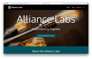
 So we’re a few weeks into the launch of our new Alliance Labs initiative here at AAM and already we’re learning a lot. In fact, the work of bringing our team together to launch this effort at all helped us to learn many different things. While I would love to tell you about how easy and smooth the whole process was – instead, I think it might be more helpful to share with you about how we almost blew it with respect to web accessibility.
First, I need to give you a little background on our approach for the Alliance Labs…
Background
As we started working on the Labs, an overarching goal was to experiment with techniques that could also be used by other museums across the country. For digital projects like this one, we are looking for solutions that don’t cost very much money and that can be completed by someone with only limited technical expertise. For all those reasons, we decided to start the Alliance Labs website with a few simple approaches that anyone can take.
 First, we chose WordPress as our web publishing platform since it currently hosts more than 25% of the internet and is a likely choice for a content management platform that any museum could easily use. In addition, as I’ve rolled out a number of WordPress sites for museum staff, it’s been the one platform that my non-technical teams have been able to easily create great content with. I’m not exactly certain why, but this has been the case time and time again. To be sure, there are many other platforms out there that make authoring easy – but WordPress is a great place to start.
Second, we had to pick a template to control the look-and-feel of the website. In WordPress these templates are called themes. We selected a theme called Avada since it was named the most popular theme for 2016 and features over 225,000 active websites. As you start to explore the never ending list of WordPress themes, you’ll begin to notice that many of them are platforms unto themselves. Avada is like this too and had lots of interesting features.
Lastly, we originally chose to experiment with Medium.com as an alternative publishing tool because of how easy it makes writing and how visually rich it can be with only a little effort. We’ve also been noticing lots of great museum content showing up on Medium recently and it would be worth experimenting with too.
We’ll spend some time in future posts to give you the details of our choices and approach as well as some tech-recipes to get you started.
Here comes the failure part
We did a really great job of selecting tools and working with our staff internally to begin creating content in-house and publishing it ourselves. The website was looking great and was slick and responsive on all kinds of screens and devices.
I’m ashamed to admit that I didn’t really think about accessibility until we were in the midst of hosting an AAM webinar on the subject. [Access the webinar] I remember sitting at my desk when the realization struck me that we’d just spent weeks promoting this webinar so that museums could learn about how their websites could be more accessible; Alliance Labs would be the very next thing we published online, and with all the planning we’d done we had not yet followed through on our own advice regarding accessibility.
So – we put the brakes on.
We postponed the project and reached out to a friend and accessibility expert, Sina Bahram. Sina was extremely patient and open to working with us, but pulled no punches that the site we’d just worked hard to create, really sucked on accessibility. (My words not his). This was a little overwhelming to say the least, but to the team’s credit, we all remained committed to learning through the process and to doing this work together. Learning is going to require stumbling sometimes and we’d just stumbled.
Even though we stumbled – we did a few things right.
- We did not back off on our desire to try our hardest to create a site that was as accessible as we could make it.
- We’re not pretending that fixing our accessibility problems is a one-time effort, but rather an ongoing process of understanding the techniques and ways of thinking that could help us be accessible for the long-haul.
- We stopped what we were doing, asked for help, and changed directions.
This sounds like learning to me!
Hear more from Sina Bahram in the video below about how museums could be more accessible. This video is a fantastic Ignite style talk that Sina gave at the Museum Computer Network conference in 2015.
Stuck

There did come a moment in this process where we felt frozen and stuck. We wanted to create a site that was accessible, but weren’t sure where to start or that we’d be able to complete the process. In fact – we were pretty sure we wouldn’t be able to achieve “full accessibility”. This was overwhelming and discouraging.
The Best is the Enemy of the Good – Voltaire
Sina’s influence was helpful again. He pointed out that our current practice was already “not accessible” and any improvements we could make on that experience would at least be a step in the right direction. It occurred to us that many museums probably get stuck here too.
Rather than waiting until we had it all figured out and perfect, we thought it would be useful for us to do our work towards accessibility in the open – sharing what we learn as we work to consistently make improvements to our online content.
So while we did a number of things to make the Alliance Labs site relatively more accessible, it’s still not where it needs to be. We will be working to improve the site step-by-step and plan to use the lessons and skills we learn to change and improve all of AAM’s web content over time.
Takeaways
Here are some quick-hit takeaways that we learned as a part of this process.
Choice of theme makes a HUGE difference
WordPress themes vary widely in their ability to support accessibility standards. While the WordPress Theme Directory does allow you to search by themes that are “accessibility ready”, many of those themes are lacking in some of the features and aesthetics you may be looking for. In addition, even themes that are marked as accessibility ready can vary widely in how they implement that support.
 While we started with the most popular WordPress theme we could find – Avada – we learned quickly that the underlying HTML and CSS code of that theme made it difficult for us to adapt its default outputs to a format that supported the recommendations of Web Accessibility Standards (See http://www.w3.org/WAI/ and http://www.w3.org/TR/WCAG20/).
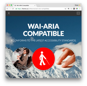
We lucked into finding a fully featured theme that also made it relatively easy to adapt the underlying code to support more of these standards. The X Theme by themeco.com (https://theme.co/x/) has been very flexible for us and has devoted some work towards complying with the WAI-ARIA standards (See https://theme.co/x/features/wai-aria-compatible/).
We did not do a comprehensive scan to find the most accessible WordPress theme available, but we did find that the X Theme made our progress in this area significantly easier.
Paying Attention to Semantic Structure
This seems like an easy one, but we neglected to do this when we started. As we used the theme to create an attractive site, we were worried about making our content “look” pretty and consistent. One simple thing we missed was ensuring that the flow of our content used headers consistently.
By simply making sure that <h1>’s come first followed by <h2>’s and subsequently <h3>’s we can add a lot of structure to our content that helps screen readers make sense of that content effectively.
Try this simple little tool to get a look at your site’s outline: https://gsnedders.html5.org/outliner/
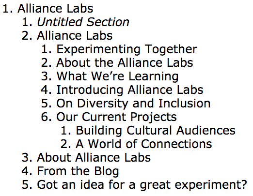
This is what the outline of the Alliance Labs website looks like today: As you can see, it’s pretty readable, but could still use some work to improve the structure and clarify some of the headings.
Tools that helped:
WAVE: The web accessibility evaluation tool from WebAim.org was SO helpful to us. (http://wave.webaim.org) Honestly, the standards documentation provided above is pretty technical and can be a little overwhelming. The WAVE tool was very helpful in decoding what those standards meant in the context of the site we were building.
Using this tool we were able to diagnose what parts of the site would be likely problems for accessibility and then test whether we understood how to fix them. Below, you can take a look at a screenshot of the WAVE results for Alliance Labs.
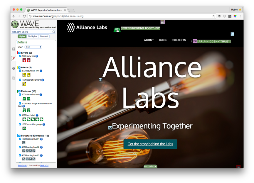
You can also run them yourself by clicking this link: http://wave.webaim.org/report#/https://www.aam-us.org/ I’d encourage you to try this on your own site and see what kinds of results come back.
Color Contrast Analyzer for Chrome: https://accessibility.oit.ncsu.edu/tools/color-contrast-chrome/
This is a tool that helped us understand when our design was causing problems of contrast or font-size that was insufficient. There are many tools that can compare the foreground and background colors of text, but this one does a good job of analyzing contrast for text and images that you probably use on your site as well.
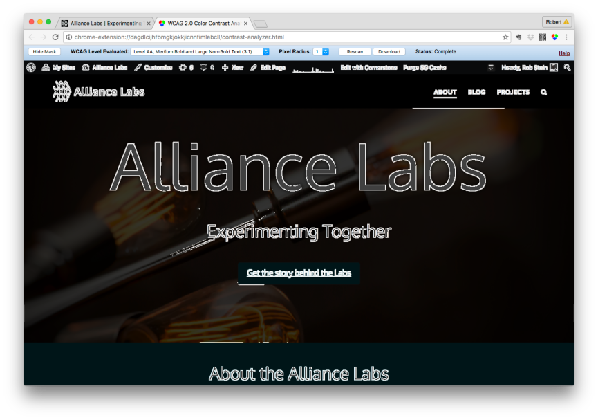
We found that by adding some simple drop shadows to many of our headers, or background shading for bodies of text – we could dramatically increase the contrast and readability of the site.
Medium.com
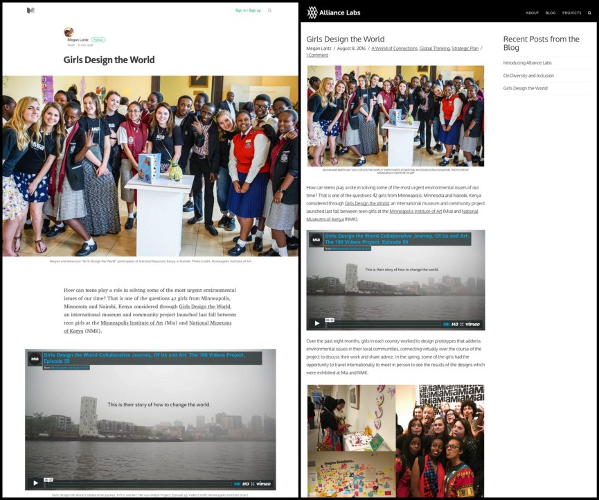
We had initially wanted to use Medium.com as an authoring platform that was free, easy to write with, and beautiful to look at. It’s responsive, works well on all devices, and has some interesting features for publishers. We had initially set out to author our stories about Global Connections on the Medium platform, but backed off as we looked harder at accessibility.
We honestly had a hard time figuring out how to do simple web accessibility things with Medium. Perhaps there will be someone reading this blog who can help us with how to make this work, but even simple things like adding alt-text to images seemed impossible.
Medium also seems to do some things under the hood that changes the rendering of the page which makes it hard to validate with tools like WAVE above. In an effort to be beautiful and simple, Medium seems to have complicated the document structure of the webpage that is invisible to most users.
I’m not saying this is wrong or should disqualify Medium as a choice altogether, only that it made it hard for us to understand how writing on that platform would be experienced by users with accessibility needs.
FYI – I find it ironic and funny that it’s difficult to find information about accessibility for the Medium.com platform without seeing only the results for articles on accessibility that are posted on medium.com – a self-referring loop.
Transcribe your video
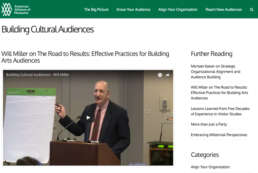
We did some great work looking into the ability to transcribe videos that we wanted to use in the Building Cultural Audiences website. We decided that we would pay for transcription services and then evaluate several different services against each other to find out which was best. (Stay tuned for that article coming soon.) It turns out that good quality transcription can be found for as little as $1 per min.
We did that for the videos we used and subsequently were able to add closed captioning for those videos in addition to populating the web pages with the transcription text so that they could be searched both within the site and from Google.
We want to experiment a bit more with enhancing those video pages to make them even more useful by linking back into the timeline of the video and hyperlinking the text from the transcription to other online resources mentioned by the speakers.
In Closing
In closing, we’re not yet in the place we want to be with the Alliance Labs website – nor with our other AAM websites – but we’re learning a lot and making some progress. These are techniques that we need to adopt into our daily thinking and practice for creating all of our content. They are not hard, they don’t have to be expensive, but they do require our attention.
Have you found tools or techniques for evaluating or increasing your website’s accessibility that you think other museums might find useful?




Thanks Rob for sharing this process and congrats for the efforts taken on accessibility. We’ll follow the next posts, for sure.
Wich level of accessiblity are you aiming to, double A or triple A?
In Catalonia, institutions governed by Public Administration -a vast amount- must comply at minimum with the double A standard. Aiming for the triple A is a recommendation. So we included this as a requirement from the beginning on our museum’s web renovation planning in 2014 (www.museunacional.cat/en).
When running the audit accessibility you are warned of any issue, and whenever it’s possible (not too costly in terms of hours of programming, etc.) and if it’s really relevant we try to have it fixed. But truth is that sometimes triple A requirements are highly costly and only affect to a tiny audience: “if the user.. .and if… and if, then you need xxx.
One thing is worrying us is the accessibility of videos, our website being in three languages. Automatic captioning is a possibility (but may contain heavy mistakes…) and transcrisption of the texts in 3 languages is either very time-consuming internally or expensive if you outsource. We are aware this is an important issue given the increase of audiovisual consumption, but have no good solution so far…
Conxa
@innova2
Thanks Conxa!
You’re right – the captioning and translation of video content is tricky. We’ve not really explored the quality or reliability of crowd-sourced translations at the moment. We have been looking more towards commercial services that can do the transcription for us and have found good quality results and turn-around times for about $1/min.
We will be writing a future blog post about our experiments with transcription and some thoughts we have about how we might use that text more effectively for web publishing. (In addition to captioning videos)
As we’re just getting started on our approach for accessibility for our own digital platforms, we’ve not landed on a decision about AA or AAA support just yet. I think the underlying question about “when is my website accessible” is a good one and one that encompasses the current standards, but also could extend to language, cognitive access, terminology and lingo, etc…
I’d love to hear from more of the field who have deeper experience in thinking / working on this. We’re starting to see some great example projects and writing on the topic.
I’d highly recommend the recently released Accessibility Guidelines from the Carnegie Museums as a terrific set of resources and thinking on the topic: http://web-accessibility.carnegiemuseums.org/
My organization uses the service Cielo24 for transcribing lectures and other events. They have a very fast turn around for English, they also offer a number of other languages. I believe their rates are pretty reasonable. They might be worth looking into! https://cielo24.com/
You are so right! We still have a long way to go to break the technological wall. Fortunately the web accessibility world has made huge strides in improving our access.
Take User1st for example (www.user1st.com) They have uncovered breakthrough technology by creating an overlay which does not change the original code of the website and is cost effective.
My sincere thanks to all those bettering our worlds accessible user experience!