Most museums, large and small, have space issues, but the problem can be much more acute for local history museums. Developing creative, space-conscious methods for mounting exhibitions and displaying artifacts at low costs can be an essential tool for small museums. The Kenilworth Historical Society, which operates a local history museum on Chicago’s North Shore, is no stranger to space concerns. The museum is relatively small with a single 800 sqft. gallery. This limited space makes it difficult to mount temporary exhibitions and host traveling shows while also maintaining a permanent exhibition dedicated to Kenilworth’s rich architectural past.
The Village of Kenilworth was established along the shore of Lake Michigan as a planned community by Joseph Sears in 1889. The Kenilworth Company, founded by Sears to develop the village, encouraged sound building methods and attracted prominent architects such as George W. Maher, Daniel H. Burnham, and landscape architect Jens Jensen. Other renowned architects soon followed: Frank Lloyd Wright, Walter and Marion Griffin, Harry Weese, Keck & Keck, and many others. The historical society has countless photographs, shelves of archival material, and dozens of artifacts directly related to these architects and their work, but little space to share them with the public.
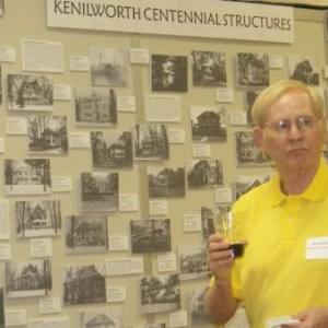
A permanent exhibit, Kenilworth’s Centennial Structures, was created in the early 2000’s to display photos and information of houses over a century old. The exhibition was very popular with residents and non-residents alike. Local visitors would look for their home and children from local school groups loved pointing out their houses to classmates. The display also pointed to the vast amount of information and materials the society possessed in its collection concerning architecture in the village. House files are the most requested materials in the museum’s archive. However, the exhibit was static, difficult to update, and took up precious space in the small gallery. The exhibit was permanently removed while the museum was being renovated in late 2017. An updated museum needed an architecture exhibition that reflected its modern space.

We aspired for the new exhibition to be compact or mobile, easily updated, accessible, contain more information than the previous iteration, and to incorporate artifacts. All of this also had to be completed at a relatively low cost before the new gallery opened in early 2018. Going digital seemed like the best option. We did not use technology for the sake of using technology, but we believed this was the best vehicle to tell the story of Kenilworth’s architectural past. Ideally, the digital site fades into the background as the visitor interacts with the content. Creating a digital exhibition had multiple benefits. It allowed us to display much more information and material than a traditional exhibition, it was easily updated, and the program cost the society nothing.
The original exhibit’s content was limited to one photo per building and a small label displayed only four facts about the house: architect, build date, style, and original cost. (The current exhibition only displays these facts, but there are plans to add more information to storied structures.) The digital nature of the new exhibition has multiple benefits:
- All centennial structures in Kenilworth were included, not just houses
- Multiple photos per structure can be displayed
- There are a variety of ways visitors can browse the structures: by architect, build date, or address (The original was just by street)
- Visitors can also quickly keyword-search for a specific property
- The exhibition could eventually be expanded to all buildings in the village
Another significant change from the original exhibit was the inclusion of razed structures. Kenilworth’s architectural pedigree is strong, but its preservation ordinances are not. This exhibition provided an opportunity to preserve the memory of historically significant structures and share them with the public. The inclusion of these demolished buildings also created a more complete picture of the village’s history and development.
Skip over related stories to continue reading articleThe main interface of the exhibition consists of blue (standing) and red (razed) building outlines superimposed over a historic map of the village. Tapping or clicking on a building outline activates a popup with photos and information about that structure. Buildings appear on the map as visitors advance a timeline at the bottom of the screen. This not only illustrates when and where historic structures were completed but also the economic development of the village. As the timeline progresses, the map reflects how the rate of construction was impacted by local and national events.
We utilized Omeka, an open source web publishing platform for sharing digital collections and creating media-rich online exhibits to build the digital exhibition. The Omeka site is hosted through the same service as the historical society’s main website at no additional cost. Omeka is user-friendly and highly customizable. It is fairly straightforward to set up; an amateur web designer should have no problem building the backend of the site. We partnered with Kelly Schmidt a Public History Ph.D. candidate at Loyola University Chicago to help set up and design the site. Using a few different plugins, including Neatline for the map and timeline, we were able to create a digital exhibition perfectly suited to our content.
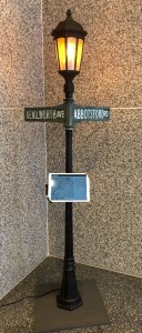
The public can access Kenilworth’s Centennial Structures from home or on their phones while walking around Kenilworth’s historic streets, but we wanted the site to have a presence at the historical society. Museum visitors can access the interactive site through an iPad mounted to a street lamp in the museum’s lobby. Original historic street signs were incorporated into the display to add authenticity to the exhibit and to creatively display an important piece of the museum’s collection. The street lamp even has a candle flame lightbulb to reflect the original gas lamps that lined Kenilworth’s streets. The combination of digital and environmental elements with original artifacts gives visitors a unique experience they would not get from accessing the digital exhibition at home or on their phones.

With the new, compact design fewer visitors are able to experience the physical Centennial Structures exhibition simultaneously. The tablet can only accommodate two or three visitors comfortably, while nearly a dozen people could view the older, larger exhibit. However, the tradeoff was worth the spatial gain in the gallery and the depth the current exhibition provides. The new location in the museum lobby (that is shared with Kenilworth’s village hall) can attract new users who are passing through. The redesigned exhibition may be less accessible physically, but it is digitally available, making it far more accessible than the previous version. Local visitors can still enjoy “walking the streets” of Kenilworth and finding their house on the digital map, but now they can learn much more about their home.
The reimagined Centennial Structures exhibition helped to alleviate some of the museum’s space concerns and refreshed an outdated, but important public display. Incorporating interactive digital technology can be an effective tool to present content in an engaging, cost-effective, and space conscious manner. Simple, open-source programs can be used to update and modernize existing content while making it more accessible to the public. Going digital does not need to be complicated or expensive. Smaller museums and organizations can use these methods to create unique and exciting projects on a tight budget and with limited space.


Comments